
The journey begins
Several months ago, a friend of mine mentioned that the US–the country that I’ve called home for most of my life–had lost it’s status as a full democracy. I became curious about what this meant, about where this came from.
Before I go any further, I want to make clear that I am NOT an expert in social science or economics. I am much more comfortable with natural sciences and statistics. But I am interested in all of these areas! So my goal in this article is to bring you along as I learn about these topics.
Getting back to my story, I discovered that my friend was referring to the Democracy Index, which has been published almost every since 2006 by the Economist Intelligence Unit. As I understand it, this index gives each country a score from 0 to 10 based on how democratic the country is, with 10 being the most democratic. Any country with a score of 8 or higher is considered a “full democracy.” Since 2016, the Democracy Index for the US has been just below 8, putting it into the “flawed democracy” category.
As it turns out, the EIU Democracy Index is just one of many indices attempting to quantify various characteristics of nations. Probably one of the most well-known and easiest to understand of these indices is the Gross Domestic Product (GDP) and it’s per-capita counterpart (GDPP). But there are other, more complex indices like the IEP’s Global Peace Index and EIU’s Where-to-be-born Index.
What’s more, the data from many of these indices can be found on Wikipedia. As a statistics nerd, this is very exciting to me! The data are nicely organized into sortable tables. So not only can I sort and browse through the data in different ways, but I can also easily copy and paste the data into a spreadsheet and do my own analyses.
Looking through the results of these indices, I noticed that in some cases, countries performed similarly across different indices; for example, the Nordic countries tend to be ranked near the top in both the Democracy Index and the Global Peace Index. This makes me wonder how much correlation there is between the various indices and how they could be combined to get a more complete picture of national characteristics.
I became really excited to download all the data from all the indices I could find and then do my own analyses on them. But a little ways into this process–when I remembered how much time it takes to clean and aggregate data from various sources–I started to wonder if anyone else had already done what I was attempting to do.
Shortly thereafter, I discovered a very interesting article…
Comparing 13 different indices of social progress
As it turns out, researchers with far more social sciences expertise that I have recently published a peer-reviewed article exploring the very topic that I am interested in. In their May 2022 article in the journal Sustainability, authors Bing Wang and Tianchi Chen use principal component analysis (PCA) to determine the degree of similarity among 13 indicators of social progress.
What they found is really interesting to me:
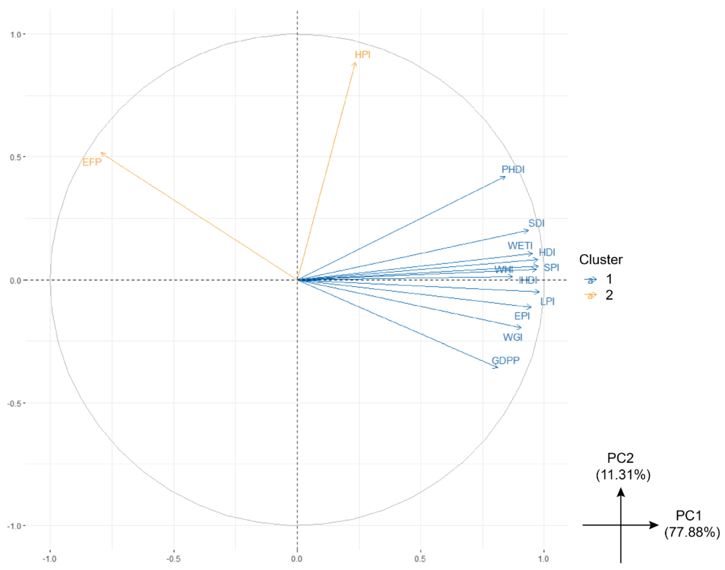
In the figure above, each of the arrows represents one of the 13 social progress indicators in the study. The angle between any two arrows gives a clue about the strength and type of correlation between two indicators; angles close to 0 degrees suggest strong positive correlation, angles close to 180 degrees suggest strong negative correlation, and angles close to 90 degrees suggest little or no correlation. [technical note: this is only true because such a large proportion of the total variation (~88%) is represented in the first two principal components of this particular PCA]
For example, the angle between LPI and EPI is small, which suggests that countries with high LPI will have high EPI, and vice versa. In contrast, the angle between GDPP and HPI is close to 90 degrees, which suggests that HPI and GDPP are not correlated with each other and thus represent distinct measures.
In fact, one of the main findings of this study is that HPI, the Happy Planet Index, is not strongly correlated with most of other indicators in the study.
Happy Planet Index (HPI)
Curious about this Happy Planet Index (HPI), I decided to learn more about it. According to WEAll (the HPI’s originator), a nation’s HPI is calculated by multiplying wellbeing by life expectancy and dividing by ecological footprint. In other words
HPI = (wellbeing x life expectancy)/ecological footprint
I like to think about HPI as a measure of how efficiently a country uses ecological resources to achieve human life quality & longevity. A country with a high HPI has residents who live long, live well, and do so with a relatively low impact on the earth. In other words, HPI is a measure of sustainable happiness.
Looking back, looking ahead
What started out as a tip from a friend about the Democracy Index turned into a journey of discovery for me. Digging into this and other indices of national success, I saw some similarities and some differences. I began to wonder if combining these indices together could give a more complete picture.
This led me to the 2022 paper by Wang and Chen in which they do just that. That paper is where I learned about the Happy Planet Index, which attempts to quantify how sustainably a country achieves the wellbeing and longevity of its residents.
Some of my questions have been answered along this journey, and new questions have arisen. I think I might end up doing my own analysis anyway, now more informed by other researchers. But I’ll save that for another time.
What do you think about all this? I’d love to hear from you below!
[…] my last article, I explored various national indices. The Happy Planet Index (HPI) piqued my […]