
In my last article, I explored various national indices. The Happy Planet Index (HPI) piqued my interest.
As I looked more into the HPI, I came across the figure below in one of the early HPI reports. This graph plots HPI against per-capita GDP (GDPc), adjusted for purchasing power parity. Looking at the graph, it seems to me like HPI increases with increasing GDPc up to a certain point. Then as GDPc continues to increase, HPI decreases.
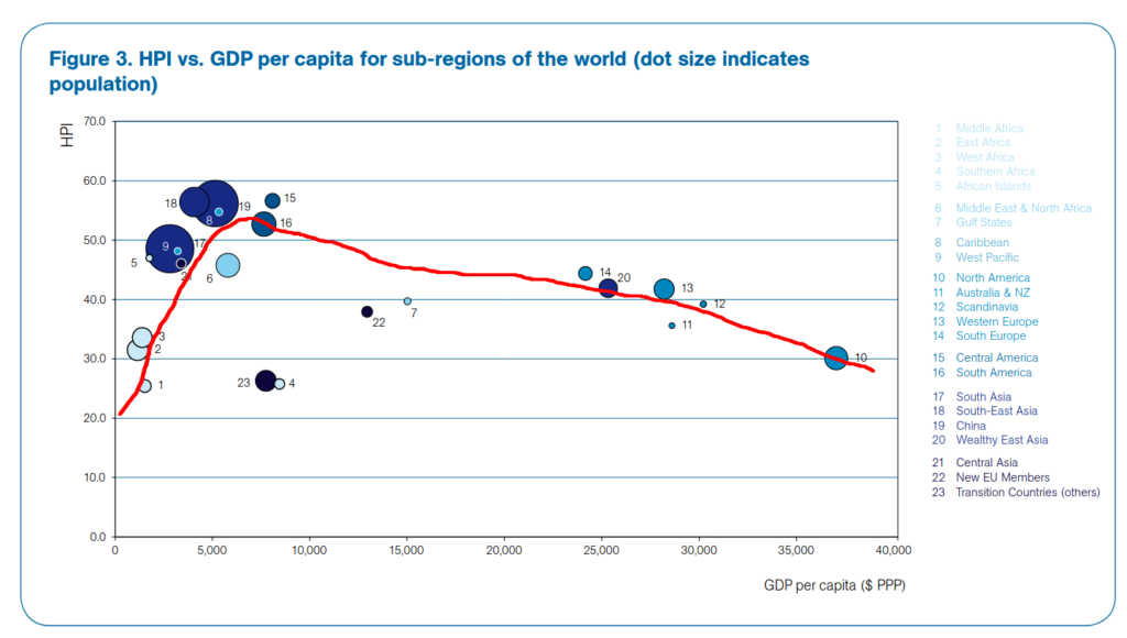
This trend caught my eye. It reminded me of the idea that, past a certain point, more money does not lead to more happiness (and may actually lead to less happiness). Or more precisely for this particular example, more production past a certain point does not lead to more overall happiness. I say “overall” happiness because as I understand the HPI, happiness is defined as a compromise between human happiness (quantified by life expectancy and wellness) and planetary happiness (quantified by ecological footprint).
I know this is a gross oversimplification, I recognize that I have some personal biases at play (e.g., preference for minimalism), and I understand that I am out of my area of expertise.
Still, this trend intrigues me.
I noticed in the plot above that each point represents a grouping of countries rather than a single country. I wanted to know if I would see a similar trend when plotting individual countries. So I found a dataset containing HPI, GDPc, and other related data for individual countries.
Data download, cleanup, and import to R
Here are the steps that I took to download and clean up the data before importing to R.
- Step 1: Download the dataset from happyplanetindex.org (Abdallah, Abrar, & Marks, 2021).
- Step 2: In the tab “1. All countries”, select data for the year 2019. [NOTE: as a result, the data that I analyze below are more recent that the data in the figure from the previous section. I wanted to analyze the most recent data.]
- Step 3: Save this tab as a CSV file.
- Step 4: Clean up the CSV file (e.g., delete top 8 rows that do not contain headers, replace missing values with “NA”, simplify column headers, etc.).
- Step 5: Import to R (see code below).
dfr <- read.csv("happy-planet-index-2019.csv") # import csv

dfr <- dfr[!is.na(dfr$GDPc.PPP),] # remove rows with missing values for per capita GDP (the only column that has missing values); this only removes 4 countries
HPI vs. per capita GDP
Next, I made a simple scatter plot of HPI vs. GDPc ($ PPP) using the code below.
x <- dfr$GDPc.PPP
y <- dfr$HPI

plot(x=x, y=y
   , xlab="GDP per capita (PPP constant 2017 $)" # according to tab "8. Data Sources" in the original dataset spreadsheet
   , ylab="Happy Planet Index")

lines(lowess(x,y), col="red") # add LOESS regression line to plot
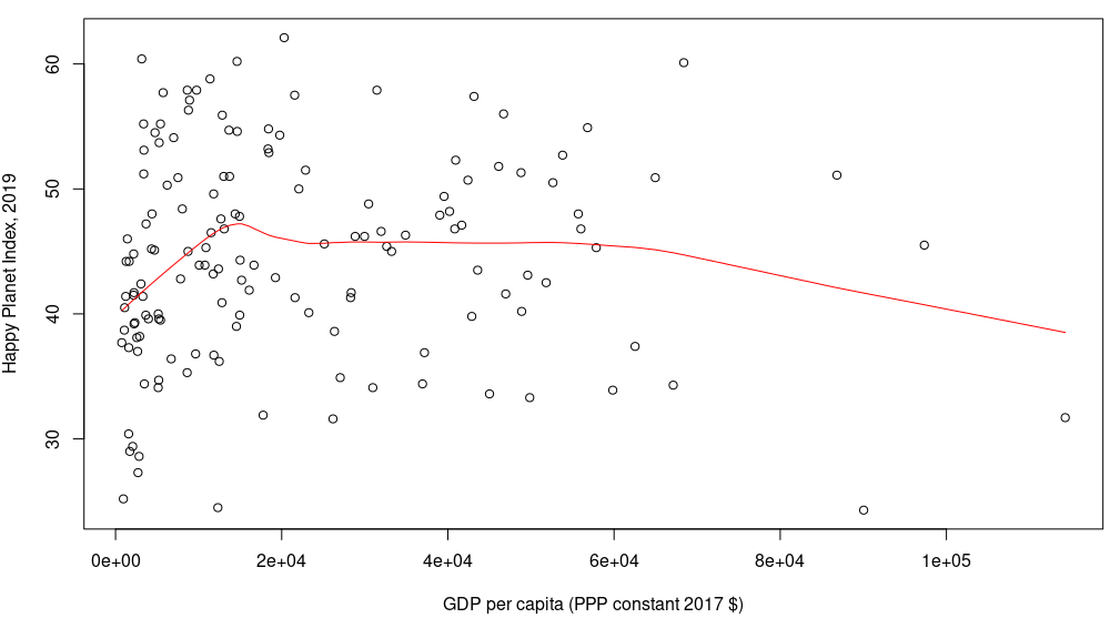
The red line represents a LOESS regression, which attempts to fit a smoothed, locally-weighted curve that best fits the data. This line has a similar shape to the line in the figure in the previous section. Namely, HPI seems to increase with increasing GDPc up to a certain point, and then as GDPc continues to increase, HPI gradually decreases.
But the trend is not nearly as clean as I had hoped for. There is quite a bit of scatter about the line. And just looking at the data points without the red line, I do not see any strong trend between HPI and GDPc.
So while there may be some relationship between HPI and GDPc, the relationship is weak at best, and there is a lot of variability about the trend line.
Relationships between other variables in the dataset
Next, I decided to take a step back and look at pairwise relationships among all six variables in the HPI dataset:
- population
- life expectancy (LE)
- wellbeing (WB)
- ecological footprint (EF)
- HPI (a composite of LE, WB, and EF)
- GDPc
To do this, I used the plot() function, which creates a matrix of scatterplots when called using a dataframe or matrix of values; presumably this is done through an internal call to the pairs() function. To add more information to these plots, I used the function panel.cor(), which adds linear correlation coefficients, and panel.smooth(), which adds LOESS curves to each plot:
# the custom function panel.cor() below is from https://gettinggeneticsdone.blogspot.com/2011/07/scatterplot-matrices-in-r.html
panel.cor <- function(x, y, digits=2, prefix="", cex.cor, ...)
{
    usr <- par("usr"); on.exit(par(usr))
    par(usr = c(0, 1, 0, 1))
    r <- abs(cor(x, y))
    txt <- format(c(r, 0.123456789), digits=digits)[1]
    txt <- paste(prefix, txt, sep="")
    if(missing(cex.cor)) cex.cor <- 0.8/strwidth(txt)
    text(0.5, 0.5, txt, cex = cex.cor * r)
}

svg("ScaterplotMatrix_6Pairwise.svg", width=12, height=8)
plot(dfr[,5:10], lower.panel=panel.cor, upper.panel=panel.smooth) # scatterplot matrix of all numeric variables in HPI dataset
dev.off()

The most interesting trends to me are the relationships between life expectancy (LE) or wellbeing (WB) and ecological footprint (EF). Both LE vs. EF and WB vs. EF appear to have similar trends, so I’ll just highlight one of them below; one can refer to the scatterplot matrix above to see all pairwise comparisons.
biocap <- 1.56 # Biocapacity per person, per year (in global hectares, g ha); from HPI dataset

y <- dfr$LifeExpectancy.years
x <- dfr$EcologicalFootprint.gha

svg("Scatterplot_LEvsEF.svg", width=12, height=8) # new SVG file
par(mar=c(5,5,2,2)) # adjust figure margins
plot(x=x, y=y, cex.lab=1.8
   , xlab="ecological footprint, global hectares (g ha) per person"
   , ylab="life expectancy, years")
lines(lowess(x,y), col="red") # add loess line to plot
abline(v=biocap, col="darkgreen", lwd=3) # vertical line corresponding to biocapacity
text(x=biocap, y=56, adj=0, col="darkgreen", cex=2
   , labels=paste(" <--- biocapacity of planet Earth (",biocap," g ha)", sep=""))
dev.off() # finish the SVG files

From this plot, it appears as though life expectancy increases with ecological footprint up to a certain point. Past that point, there is essentially no correlation between the two. And compared to the HPI vs. GDPc graph in the previous section, the data points here seem to be relatively close to the LOESS curve, indicating a relatively tight relationship between life expectancy and ecological footprint.
This trend suggests to me that at the national level, using more ecological resources past a certain point does not add to life expectancy (or wellbeing). Pretty cool!
The plot above also has a vertical line at 1.56 g ha, which indicates the per-person biocapacity of the planet in 2019. Basically, this is an estimate of the maximum ecological footprint (per person) that the Earth could sustain at 2019 population levels.
It is somewhat disappointing that the point at which the LOESS curve levels off (~5 g ha) is over three times the Earth’s biocapacity. I interpret this to mean that, on average, people in countries that maximized life expectancy in 2019 were consuming at least three times as much of Earth’s resources as would be sustainable for the planet. This is disheartening to me.
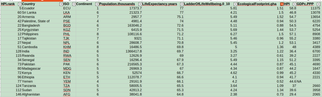
However, it is interesting to note that a few countries had relatively high life expectancy AND a per-person ecological footprint below 1.56 g ha; these are represented in the plot above as points to the left of the green line and with large y values. The ones that top the list are Ecuador (77 yrs), Sri Lanka (77 yrs), Armenia (75.1 yrs), Palestine (74 yrs), and Bangladesh (72.6 yrs) [also see below for an excerpt from the dataset]. Compare these with Hong Kong, which leads life expectancy at 84.9 years but has an ecological footprint of 8.6 g ha (about 5.5 times the sustainable limit of 1.56 g ha).
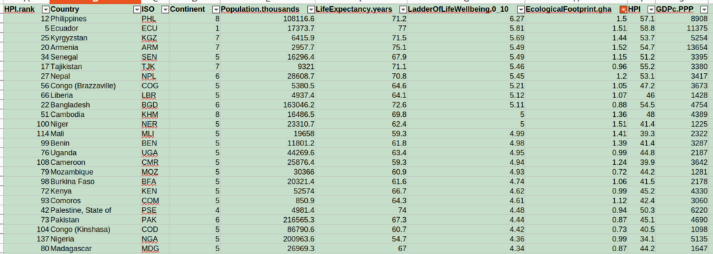
Doing the same analysis with wellbeing score instead of life expectancy, the countries that top the list are Philippines (6.27), Ecuador (5.81), Kyrgyzstan (5.69), Armenia (5.49), and Senegal (5.49). Compare this with Finland, which leads with a wellbeing score of 7.78 but has an ecological footprint of 5.67 g ha (about 3.6 times the sustainable limit of 1.56 g ha).
It is interesting to me that Ecuador and Armenia are both in the top five for life expectancy and wellbeing among countries with ecological footprint under the 1.56 g ha sustainable limit. It makes me wonder how these countries are able to accomplish such a feat, what life is like for people living there, and what the world can learn from these countries about how to live happy, sustainable lives…
References
- Abdallah, S., Abrar, R. & Marks, N. (2021) The Happy Planet Index 2021 Data File. Accessed from www.happyplanetindex.org
- Campus, A., Porcu, M., & others. (2010). Reconsidering the well-being: The Happy Planet Index and the issue of missing data. Cagliari: Centro Ricerche Economiche Nord Sud.
- Marks, N., & Murphy, M. (2006). The happy planet index: An index of human well-being and environmental impact. New economic Foundation (nef). https://neweconomics.org/uploads/files/54928c89090c07a78f_ywm6y59da.pdf
I’d love to hear your thoughts in the comments below!